 |
| Made with Nuance by Magenta |
I have shown you "smooshing" before, but this time I'm taking it up a notch. You can view my previous posts on smooshing here and here.
 |
| Made with Distress Ink |
This time, instead of applying color to a blank panel, I stamped and embossed an image first, using White Diamond embossing powder by JudiKins.
My panel was cut from Tim Holtz watercolor cardstock, using the largest die in the set LF768, Lawn Fawn Small Stitched Rectangle Stackables. This die gives a stitched edge around a panel 3.75" x 5". If you don't have this die, you can just cut your panel to this size with a paper cutter. this is the perfect size to be able to mat with a colored piece of cardstock before you mount it to an A2 size card.
Also of note is that I like the Tim Holtz watercolor cardstock because it's white. When I mount it onto my base card, which is also white, it coordinates well.

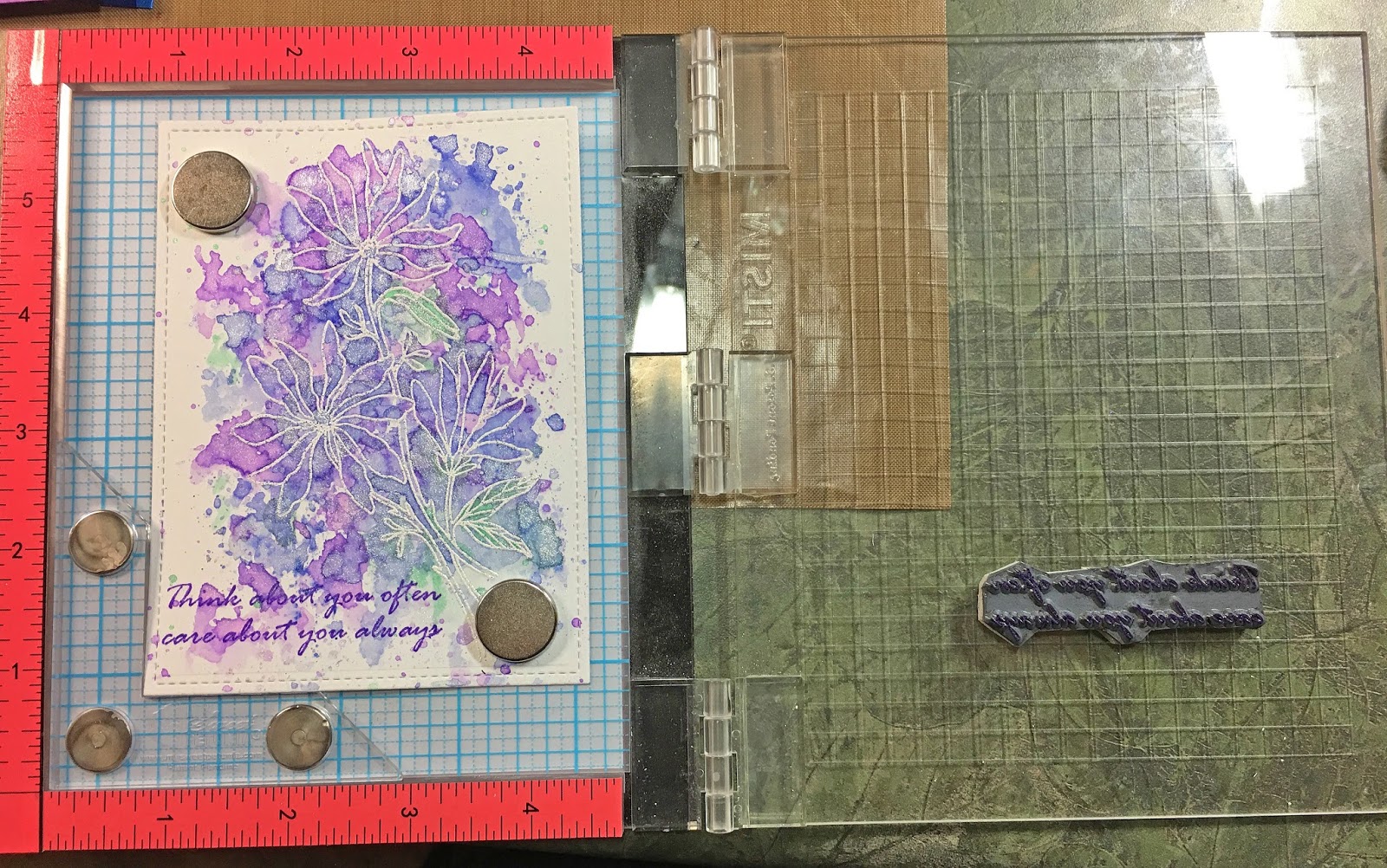
Note in the above image that I'm using one of the new MISTI Creative Corners. I LOVE these! This way if I'm using a large stamp, and it comes close to the edge of my panel, I can set it away from the ruler edge of the MISTI. I don't seem to get a good image when my stamp is close to that edge. This corner is being used in the mini MISTI by the way, and works just fine.
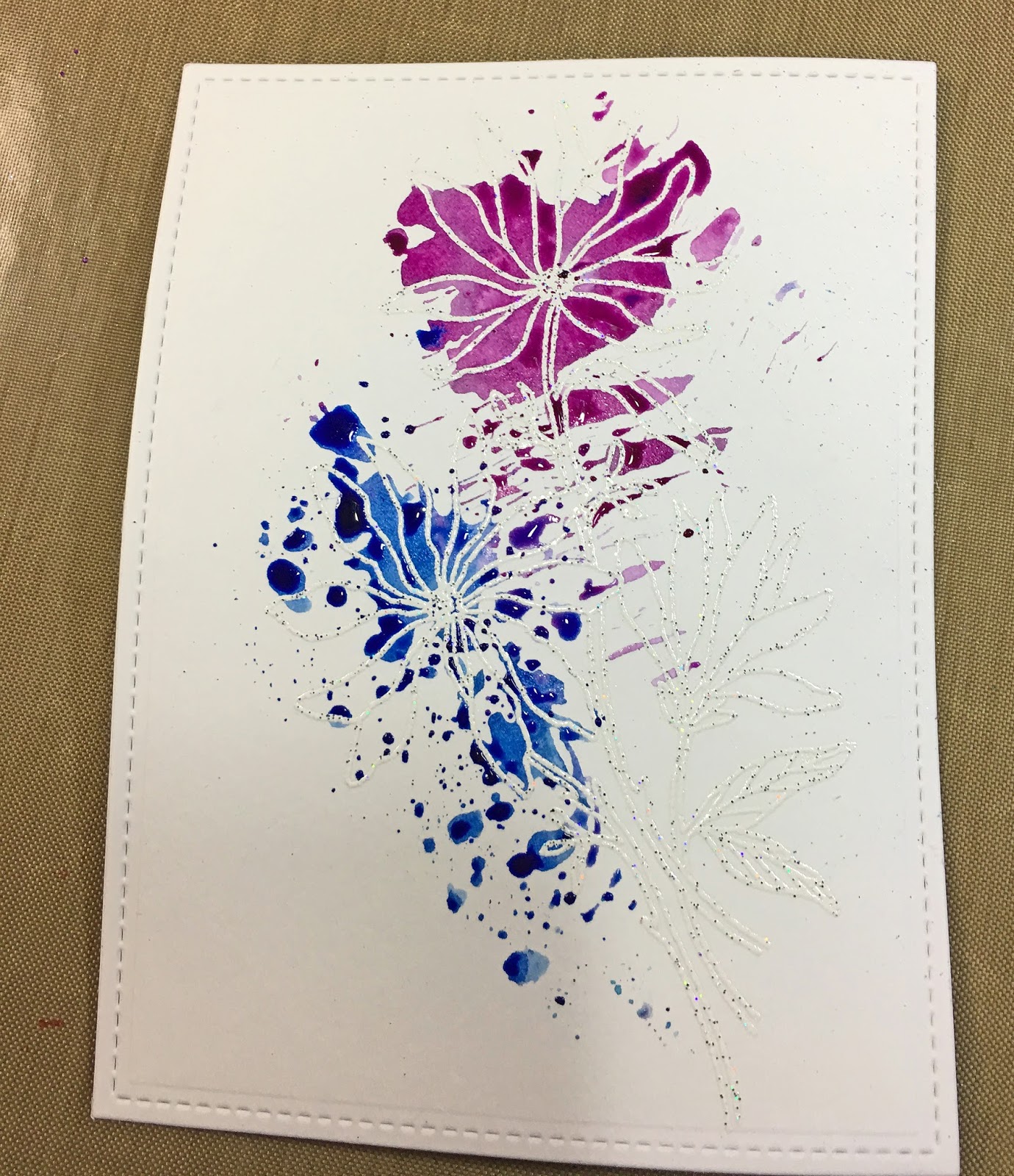
I also decided to try Smooshing using Distress ink on one panel and Nuance on a second panel with the same stamp. I'm using Distress first.
 |
| Magenta Stamp 14.639.P Three Flowers, Distress ink in Wilted Violet, Blueprint Sketch and Cracked Pistachio |
Another difference this time is I applied the ink to my craft mat and sprayed it with Pearly Water (1/4 tsp Perfect Pearls Powder mixed with 2 oz water). Last time I applied the ink directly to the acetate and sprayed it there. I think this new way I can get better control over which color I'm using at any given time.
 |
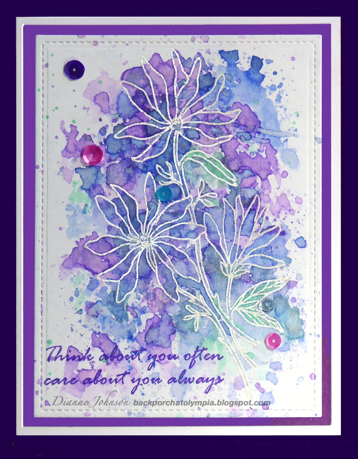
| Wilted Violet first |

After picking up the ink with the acetate, I dabbed it around on the panel, taking care to apply it to the embossed flower areas.

Picking up additional colors with the acetate, I continued to dab ink around the embossed image.

As the ink is added, the image pops out of the layers of color. I noticed that the Distress ink has a transparent look to it so that you can see layers through layers.

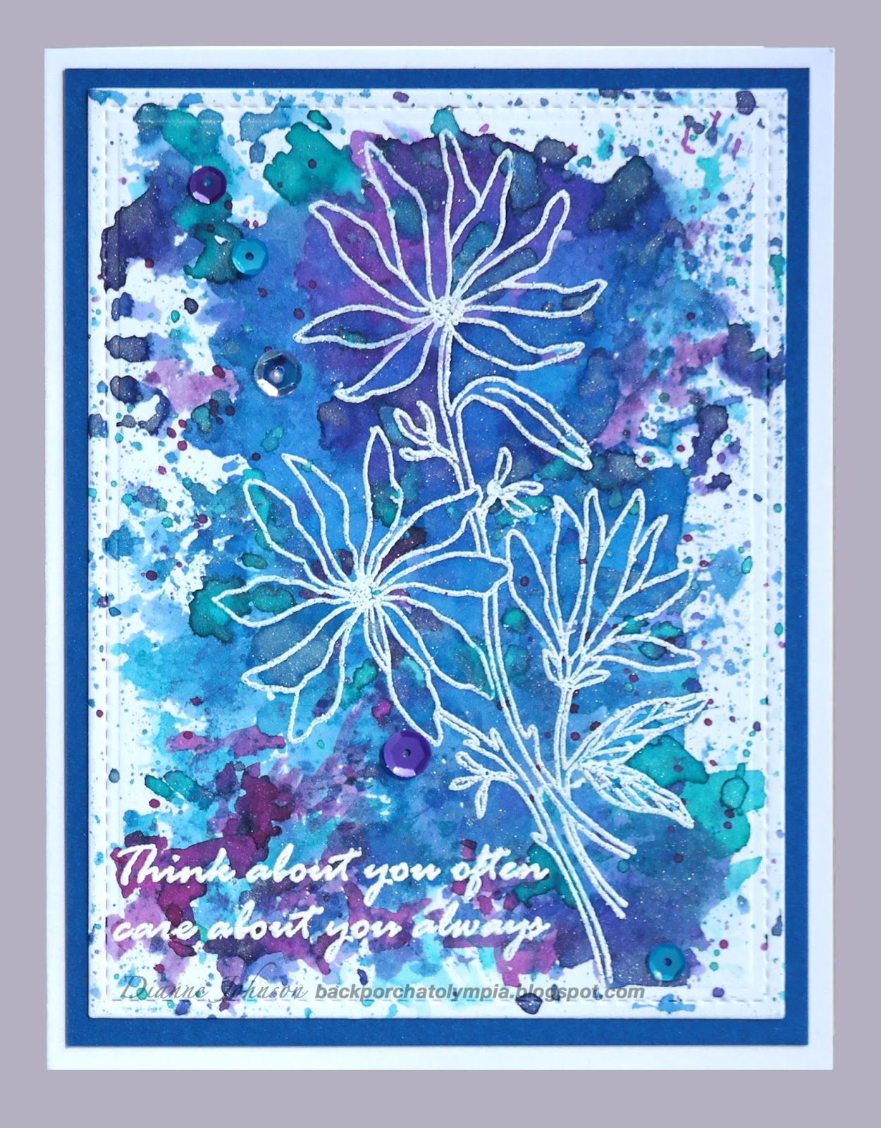
Next I decided to try Nuance, used the same way. I chose Raspberry, Cerulean Blue, and Aquamarine.

I tapped the powders onto my craft mat and sprayed with Pearly Water.

The first thing I noticed is that the colors are darker and more vibrant. You can probably get lighter colors if you spray the powder with more water. In order to get the colors to spread out onto the embossed areas, I occasionally scraped the puddles of water with the edge of the acetate.
I continued applying the different colors. I noticed that the Nuance seems more opaque than the Distress ink. I love the vibrancy of the Nuance.

At the end, I used a paintbrush just a bit on both the Distress and Nuance panels to be sure color got where I wanted it around the embossing.
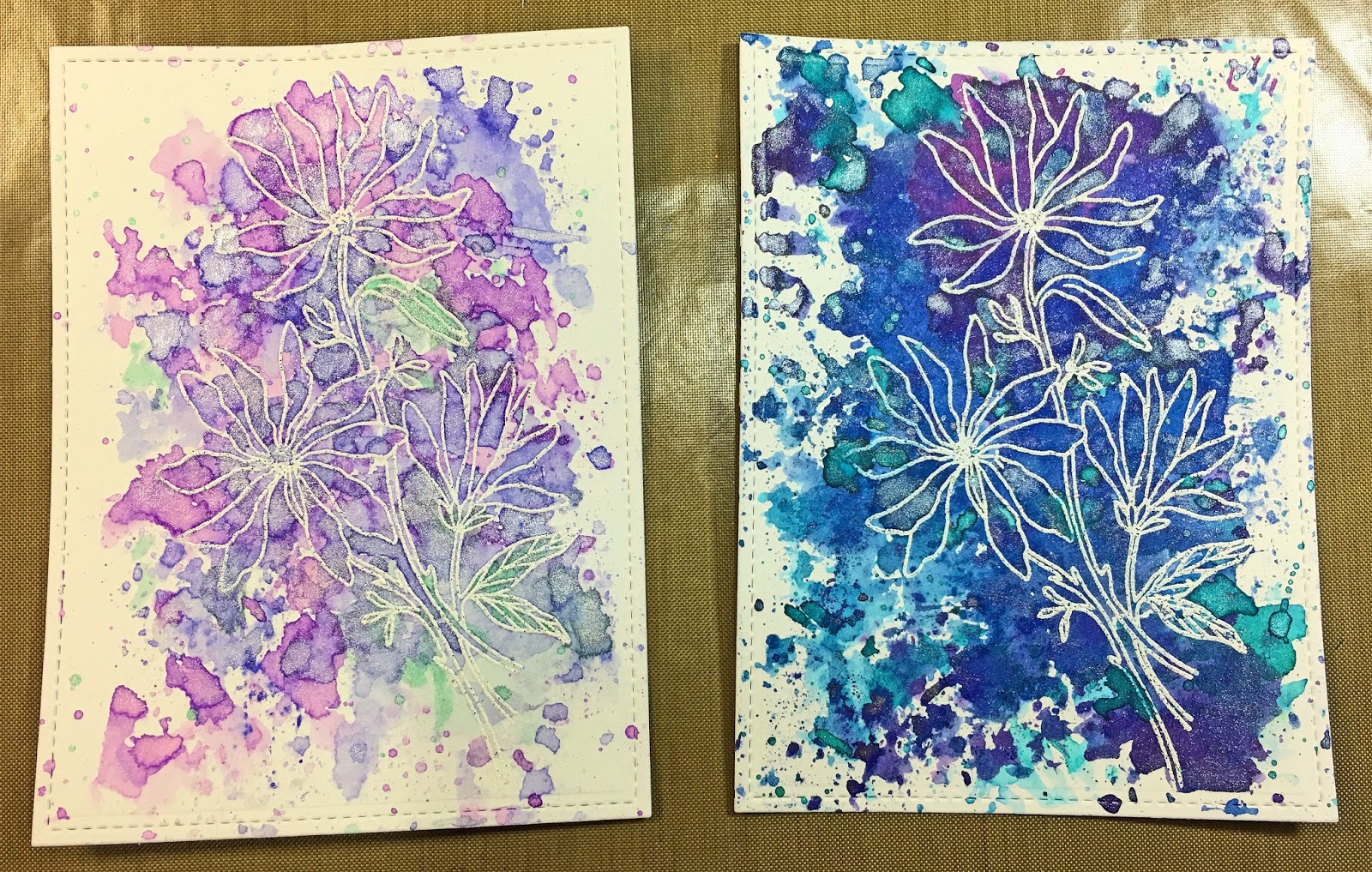
Here are both of the panels, Distress on the left and Nuance on the right. They are completely different, and I love them both.
I added the sentiments last, using Magenta stamp 07.954.G Think about you often (one of my favorite sentiments). On the Nuance panel, I stamped with Nuance and embossed with JudiKins White Diamond embossing powder, just as I had for the main image. This step could easily have been done when I stamped the flowers.
On the Distress card, I decided to stamp the sentiment with Wilted Violet Distress ink to match the main image. One of the many things I love about the MISTI tool is that now we can actually stamp with Distress and not worry that it will be too faint or blotchy. You just keep inking and stamping until you are happy with the color.
Note that here I am again using one of the MISTI Creative Corners (in the mini MISTI). This sets the panel away from the hard side and bottom of the MISTI and allows for a better stamping.
I hope you try this smooshing technique to color your stamped and embossed images. It's easy and it's fun, and you can probably use things you already have around.
Magenta Products Used:
(If you are local, please look for products at Art 'n Soul. If you are not local and wish to find Magenta products, you can click on the link in the stamp or product name below each image, or you can visit the Magenta online store here).
 |
| Three Flowers 14.639.P |
 |
| Think about you often 07.954.G |
Nuance colors:
 |
| MNU007 Raspberry |
 |
| MNU011 Cerulean Blue |
 |
| MNU020 Aquamarine |
Other Products Used:
Tim Holtz Watercolor cardstock
Distress ink: Wilted Violet, Blueprint Sketch, Cracked Pistachio
Perfect Pearls Powder
Scrap of Acetate
Versamark ink
JudiKins White Diamond embossing powder
Lawn Fawn LF768 Small Stitched Rectangle Stackables
So Silk Fair Blue cardstock (for matting)
So Silk Passion Purple cardstock (for matting)
Neenah Solar White 110# cardstock (for base cards)
sequins from Neat & Tangled
Lovely Dianne !! <3
ReplyDeleteThank you Carole!
Delete